Refactoring of an old system to a modern web-based application for a medical company, improving usability, consistency and overall experience.
🔒 For data privacy reasons, information on this project is limited.
Year2025–2026
RoleProduct Designer
ClientUrgencias Medicas
PlatformWeb
Context
About the project
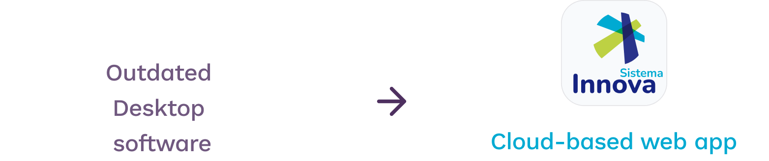
Innova is the result of refactoring an old desktop system that was used at URG (a large medical services company in Argentina). The old software was already difficult to maintain and scale. It was a enterprise platform used by operational staff to manage complex, data-heavy workflows. The project focused on the modernization of a legacy system that had evolved over time, accumulating usability and consistency issues while supporting a large and highly accustomed user base. Despite these issues, the system was business critical and used by operational teams on a daily basis.
Rather than a visual refresh, the goal was to improve clarity, scalability, and maintainability without disrupting existing operations.
For this reason, the company decided to hire a team of PMs, developers, and UX designers to conduct an in-depth analysis/audit of the business, architecture, and usability.
Challenges & constraints
🗄️An extremely large database of years of stored medical records and sensitive information.
🔒Ensuring the confidentiality and protection of patient information was a top priority throughout every design decision.
🔄Long-term users had to adapt to the new system. Managing resistance to change was a key challenge.
⚠️Obsolete features and data (e.g., fax), and inconsistent UI patterns across modules needed addressing without disrupting existing workflows.
🧩Complex user journeys and user roles, each with different needs, permissions and levels of technical confidence.
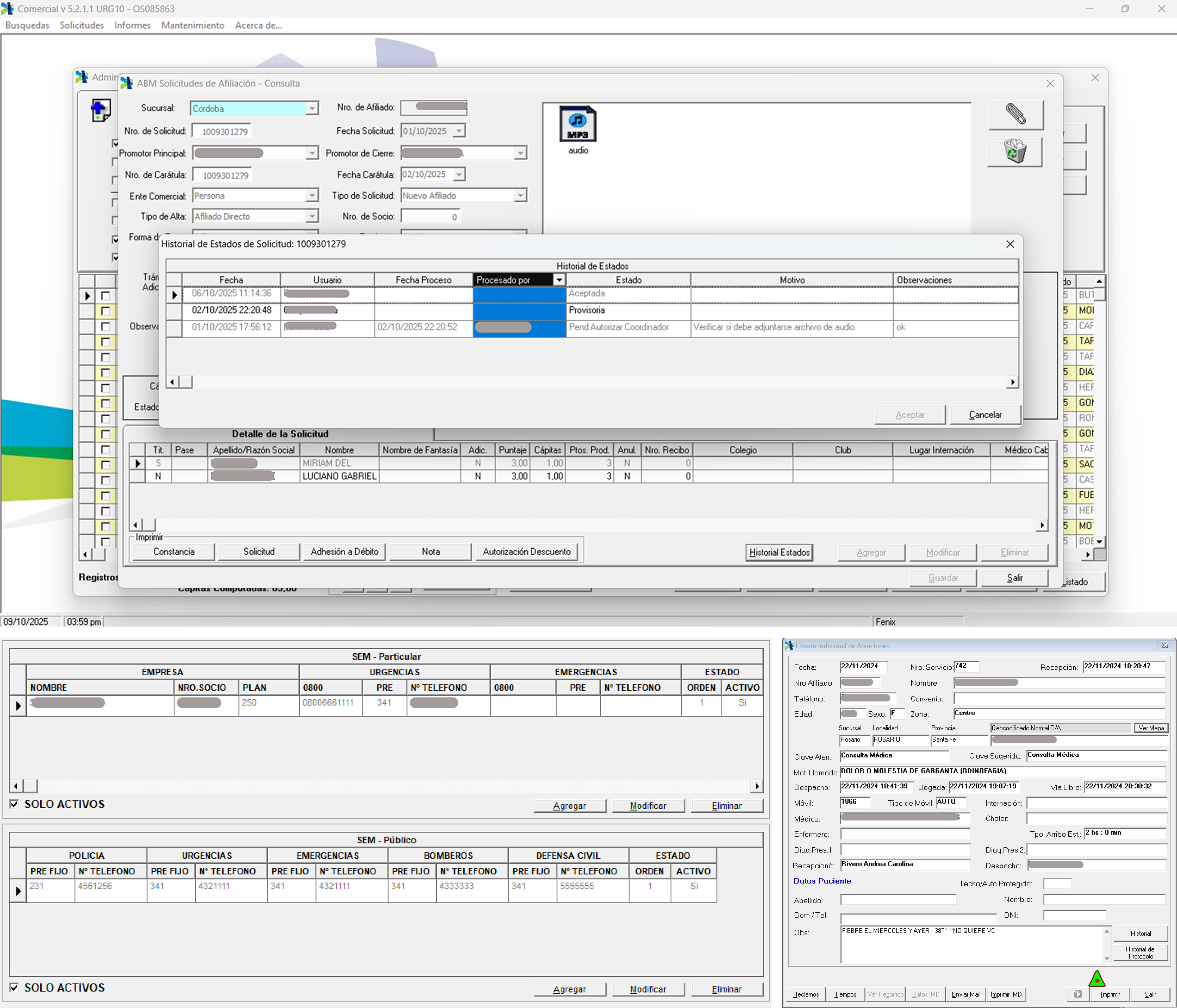
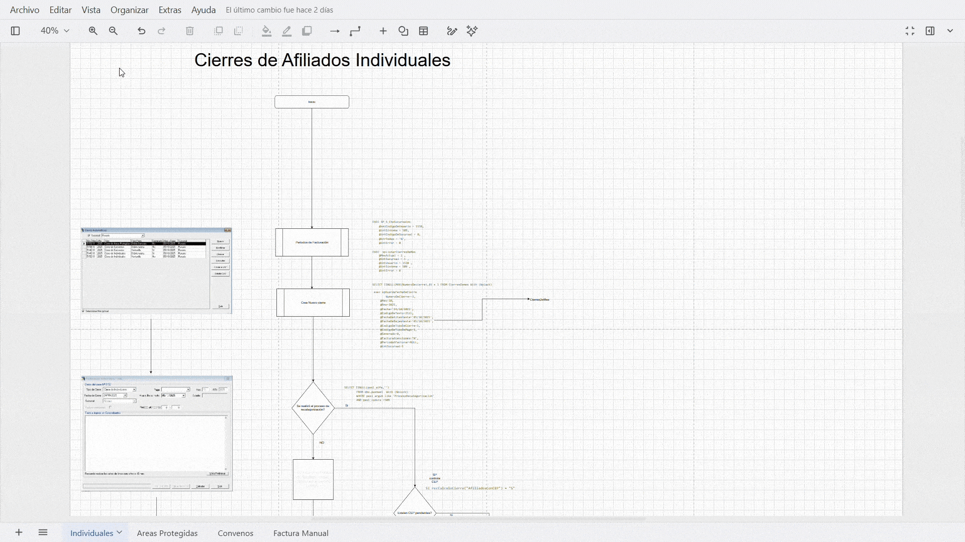
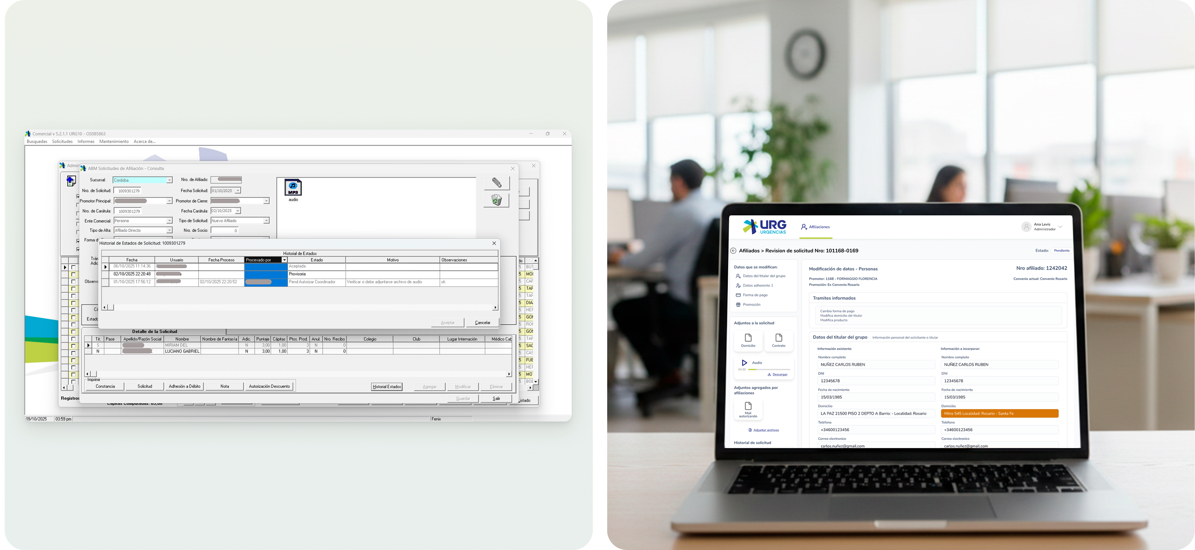
Snapshoots of the old system
My role
My role in the project
I collaborated with a Product Manager, Business Analyst, and the development team, aligning design decisions with business needs, technical constraints, and stakeholder expectations.
Audited the existing system to map current flows and identify usability issues
Defined the new information architecture and navigation structure
Conducted stakeholder workshops to align on priorities and objectives
Created wireframes, user flows, and high-fidelity prototypes in Figma
Built a design system to ensure consistency across all modules
Iterated designs based on feedback from medical staff and administrators
Handled full design handoff with specifications and component documentation
Proposal
Proposal
The design proposal centered on three core principles: clarity for medical staff who need to act quickly, consistency across all modules, and scalability so the system can grow with the company.
Objectives
Objectives
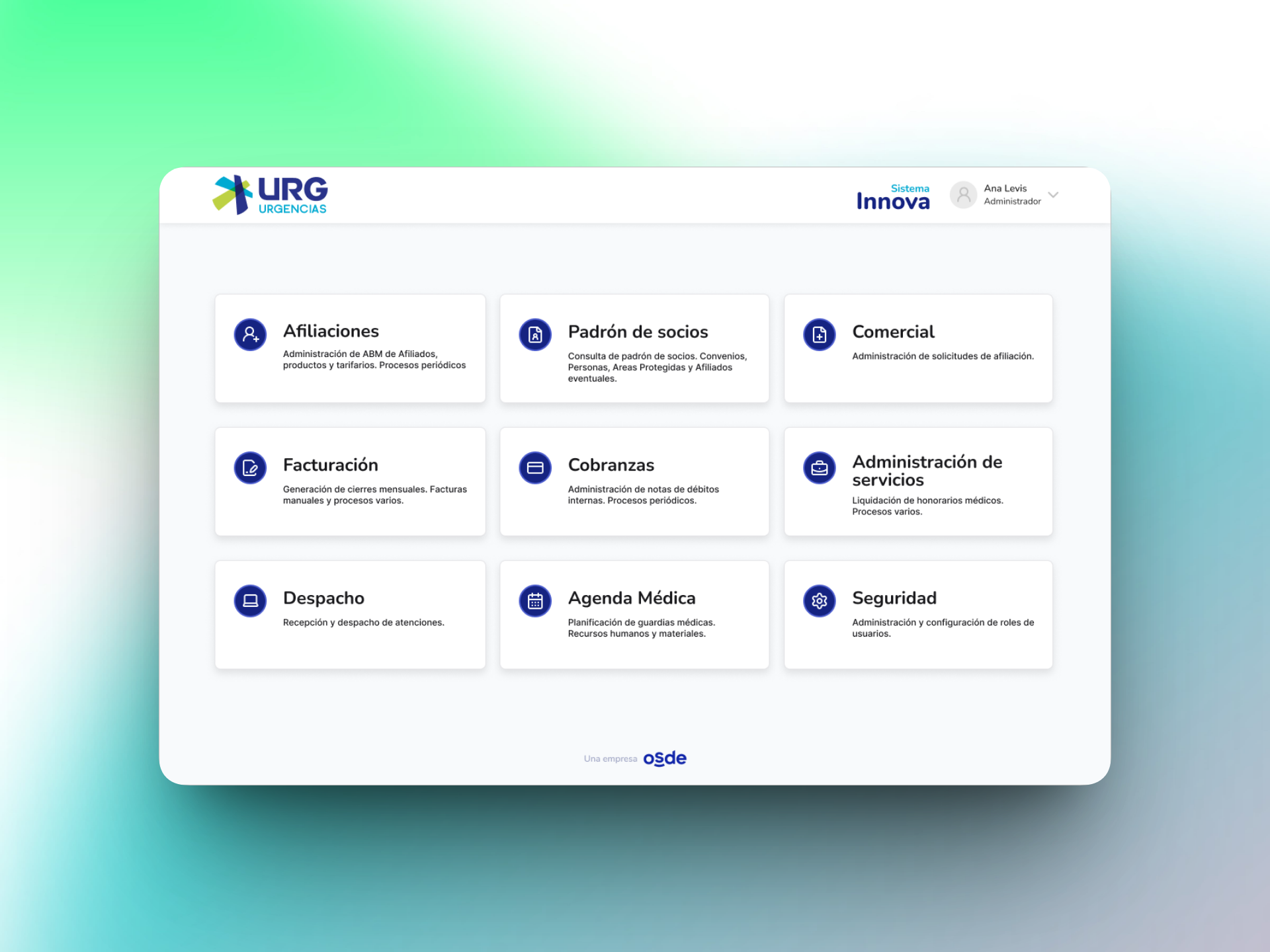
Create a new module-based navigation system. Each module groups together functionalities for each user and permissions associated with each user.
Improve consistency in visual language, patterns and interaction across all modules
Reduce the number of steps required to complete the most frequent tasks
Provide clear application for all user flows and permissions based on role
Design a scalable system that supports future module additions and team growth
Discovery
Understanding the business
Before jumping into design, I invested time in understanding the business context, the existing system, and the mental models of the people who use it every day.
The discovery and reserach process involved remote meetings to gather all the necesary context, pain points and needs. It involves collecting data, analyzing it, and identifying key areas for improvement.
Also, it was a priority to map the workflows of the the new experience. By creating this maps, we keep everyone aligned on how the experience should work.
Knowing the users
Users
The app users are the company's administrative staff and secretaries.
Each employee has defined and specific tasks within the organization.
The challenge was to identify each person's role in order to create specific user roles with permissions for each one. Each employee can only access the app modules to which they have been assigned permissions.
👩⚕️
Medical administrators
Manage patient records, affiliations, invoicing and billing. Need fast access with minimal friction.
⚙️
System administrators
Manage user permissions, invoicing, comercial, system configuration, and security settings.
Architecture
Navigation proposal
To enable users to navigate the different pages within each module, I proposed two alternatives:
Side Navigation: Benefit: Scalability. Allows you to add many items and sub-items
✅Top navigation: Benefit: More screen space. Top navigation was chosen, as we needed space in the viewport for the amount of information to be displayed.
Visual foundation
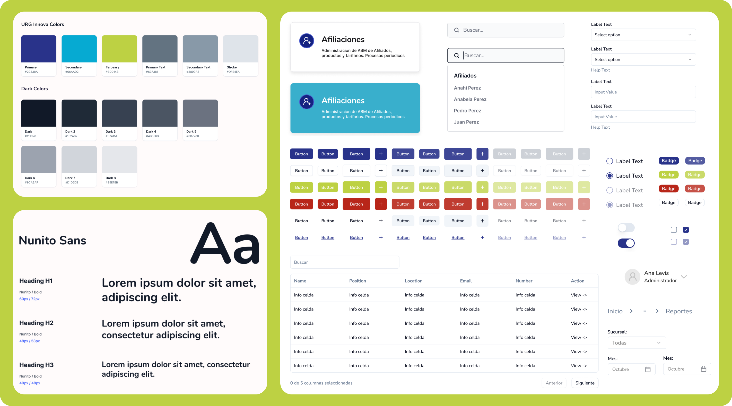
Design system
The design system established a consistent, scalable foundation that reduced UX debt and supported long-term product development.
The choice of typography and color palette is aligned with the company's brand to maintain visual and aesthetic consistency.
Innova — design system / component library
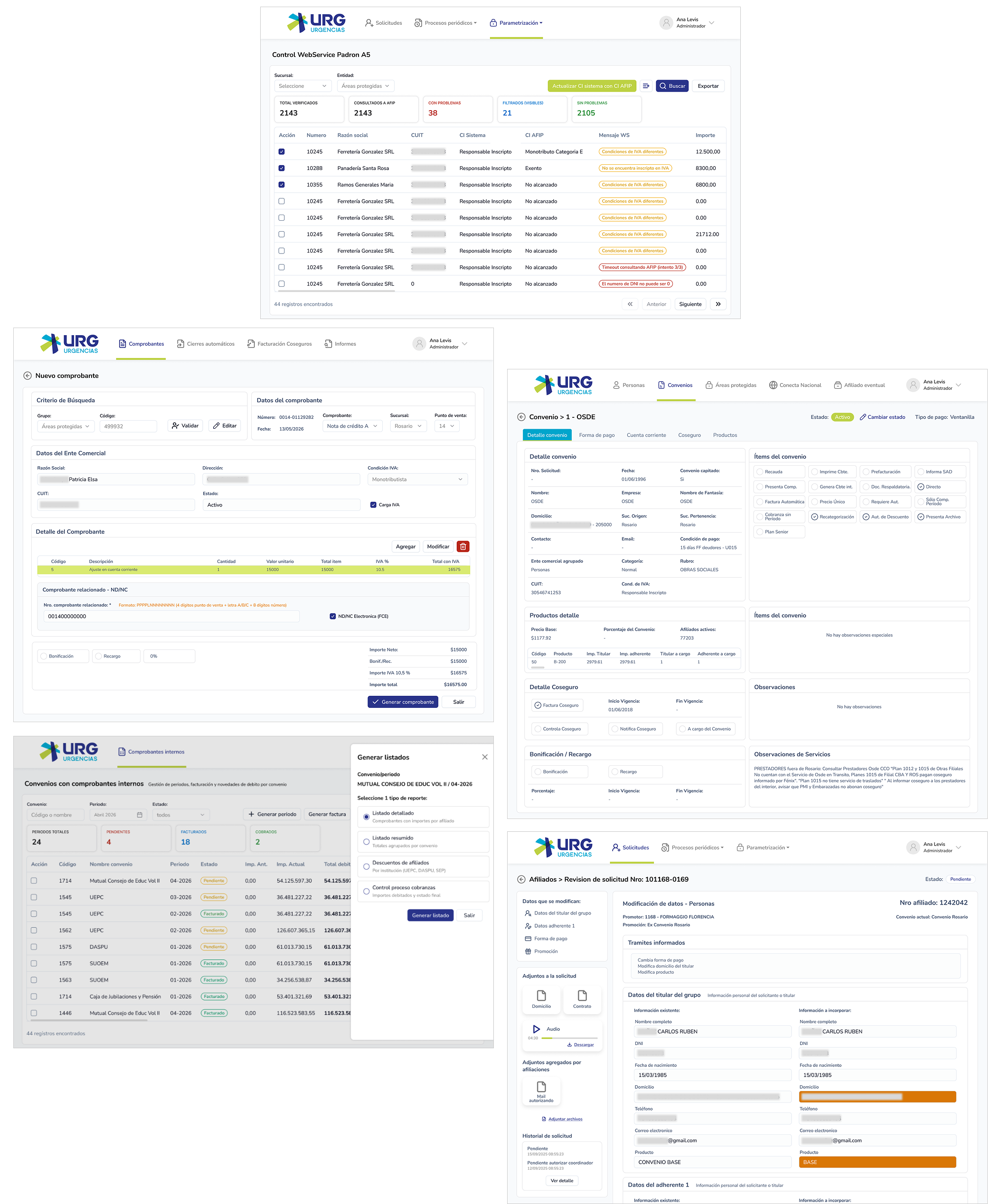
Screens
Prototypes
The first iteration focused on the core modules: affiliations, invoicing, medical agenda, and security.
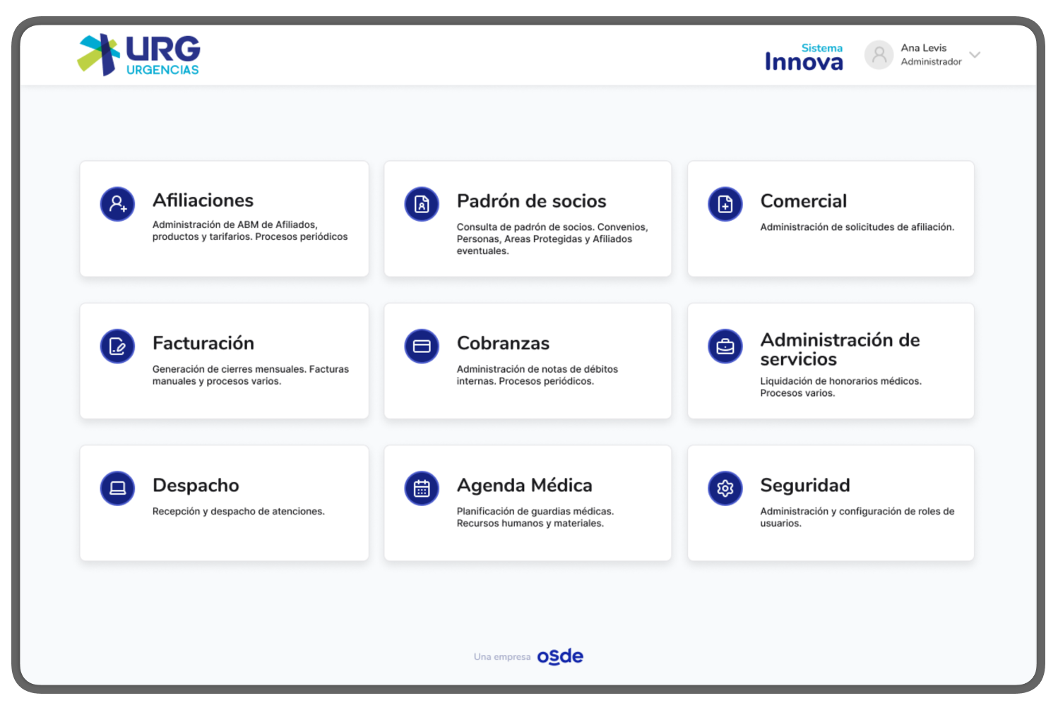
Landing of modules: Each employee has view and access only to the modules for which they have permissions. In this view, we see a case where the user has access to all 9 modules of the system.
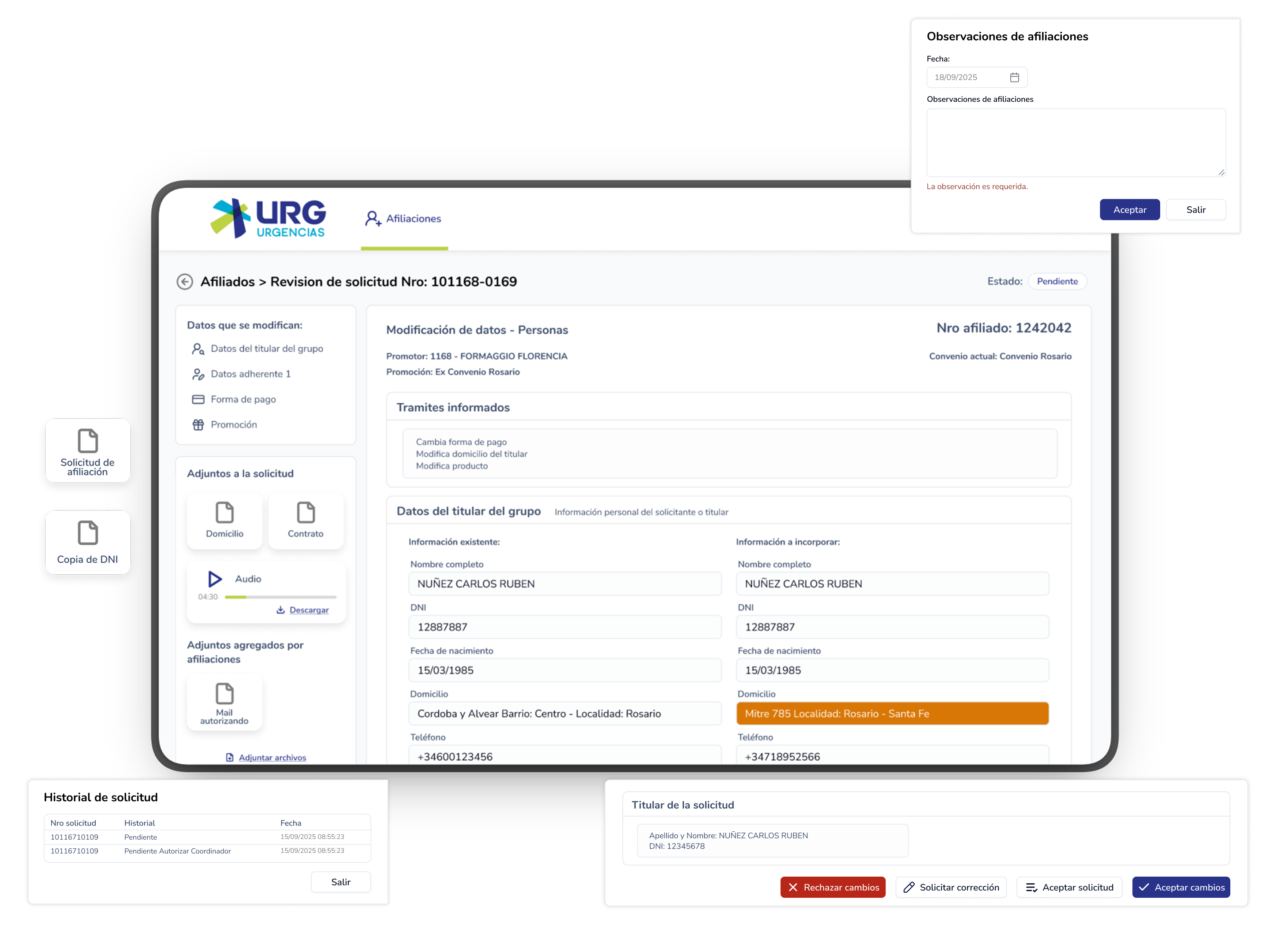
Affiliation requests: administrators can register, cancel, or modify requests from new members.
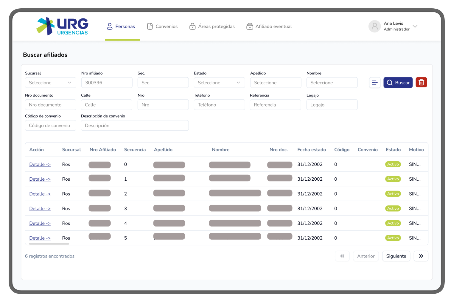
Heavy-data tables: Information queries are made using filters, and the results are displayed in tables optimized for quick reading and navigation between data.
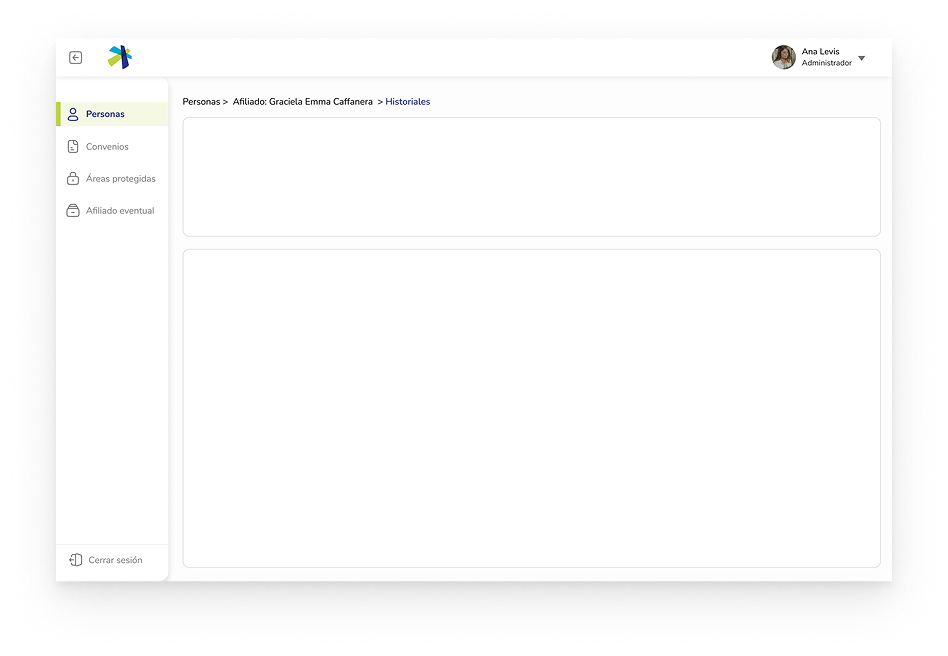
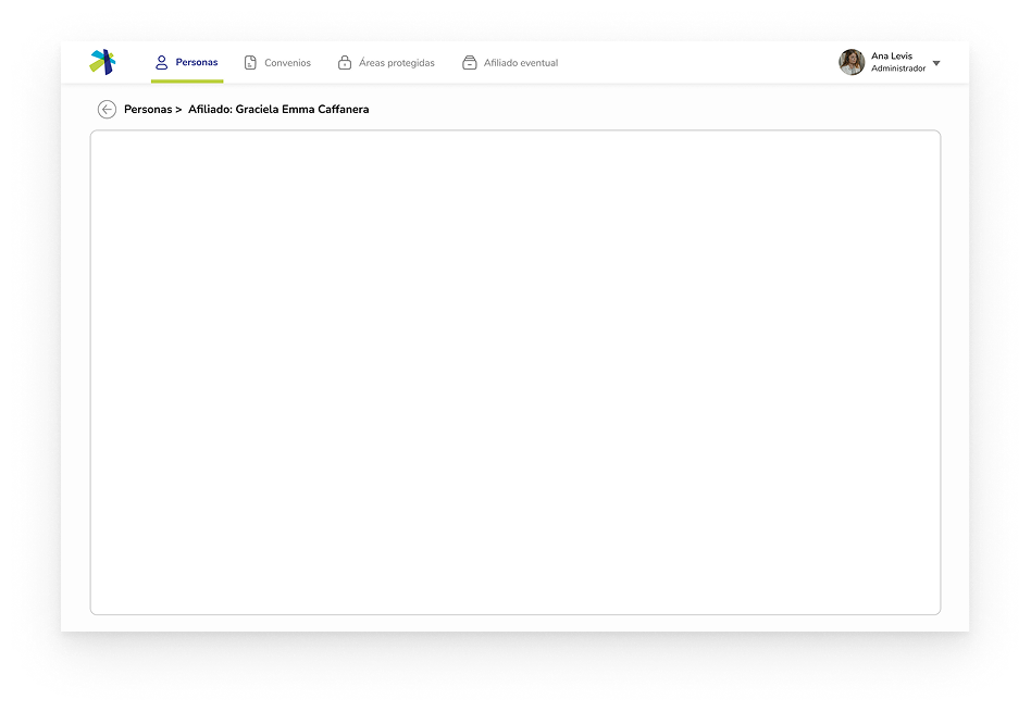
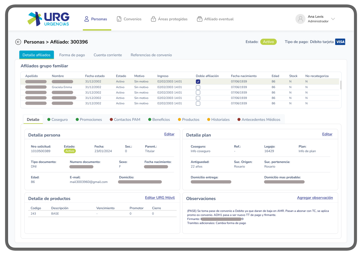
Detail of a consultation: Each record stores a lot of information. The information was divided to be displayed in tables and grouped into tabs to facilitate quick querying.
Comparison
Before and after
❌ Before
Outdated visual language
Inconsistent components
Confusing navigation
No design system
✅ After
Modern, clean interface
Consistent design system
Intuitive navigation
Scalable component library
Results
Impact
The design solutions helped to make the system more usable and efficient for internal users: by reorganizing workflows, simplifying navigation and UI patterns, we reduced user friction and helped teams perform their tasks faster and with fewer mistakes.
By adopting a user-centered approach and aligning with business requirements, the app became more aligned with end-users actually needed, which increased adoption, reduced training and support load, and supported long-term maintainability.